Wednesday 30 December 2009

Amazing flash video

An interactive music video. I've been using Flash for a good few years now but I still can't imagine how someone would create this.
http://soytuaire.labuat.com/

Typographic product design

While looking for inspiration across the internet, I came across this fantastic piece of design. It's a shame I can't find any details about the product itself or the designer that created it. Basically each part has a different purpose, clearly outlined below. There's a radio, MP3 player, woofer, speakers, and a wireless LAN adapter, all controlled by a central remote. If anyone finds any more on this I would love to know. I've seen it on 2 websites but neither could supply any details and I originally saw it on the fantastic Touchey.com which I will blog about at some later stage.


Saturday 26 December 2009

5 websites you should know about


An art collective with a difference. This website combines art by top artists from all over the world into 'Chapters', each described by one word only, "Noir", "Temple" and "Requiem" to name a few. Always full of quality, variety and above all, great for inspiration. Updated every month or so with a new chapter.


Deviant Art is a website community where you can share your artwork with the world. Get it seen, get it rated, get feedback, get tips, get encouragement. The community is friendly and welcoming, if a little impersonal.


Need to learn any piece of software in a hurry? Some idea of what you need to do but no idea how to do it? This website is an all-in-one tutorial package for everything. Literally. This website has taught me everything I know over the last 6 years!


A blog belonging to David Airey, a graphic designer/identity specialist located in Northern Ireland. I subscribe to a lot of blogs, but this is really one of the only ones worth paying attention to. Fantastic for advice, always asking controversial design questions and with a great community backing, he manages to explain his whole workflow and thought processes for every project he takes on.


A design website handy for a few things, including daily-updated content, tutorials, webpages and its famous "Daily Inspiration" pictures. A gold-mine of strange imagery.

Cinema 4D test

I've just got a new software package called Cinema 4D. I've only used a handful of 3d modeling packages up until now but it's still obvious to see the benefits, even for a newbie like me. Where you might be using 3dmax for complicated modelling, or you might be using Maya for the advanced rendering options, Cinema 4D seems to be uniquely geared toward ease of use while still delivering top quality results. To start with, all the options you'll need are on handy visual menus, everything from modeling to lighting and rendering. It's easy to get stuck in and renders can be as complicated as you want them to be. Below is my first attempt at rendering a scene.


Saturday 19 December 2009

Iconic photo

The Brief:
You must recreate an iconic photo in studio conditions. "Iconic" is open to interpretation and includes people, scenes, classic photography and work by well known artists, but no paintings are allowed. Afew subjects have been blacklisted including the Pulp Fiction image, Breaskfast At Tiffany's and anything by Man Ray.

All of the images for this recreation were taken by a talented graphic designer called Didi Blackhurst. You can find more of her work here. For this project I chose a self portrait of Andy Warhol, an icon himself, originally taken in a photobooth.


Letterpress workshop in Hoxton

Some photos from the day.


Thursday 17 December 2009

"The Rules"

The Rules:
1. You must make 50 pieces of artwork sized a maximum of 95mm x 130mm.
2. This can consist of 50 x 1 piece or up to 50 different pieces of work.
3. The work can be based on anything, but should be influenced by an artist's book or by the title "The Rules".
4. The piece will be swapped and handed out to ever member of the class and 2 teachers, until everyone has one of everyones.
5. You must design a holder that is visually congruent and large enough to holder 50 pieces of A6.
6. The holder must either be in the form of a book, or a folder.

The results are shown below. The top two images were used to make a holder for the artworks and the bottom was used as the artwork itself.


Comic sans destroyed

The white chocolate experiment.


Wednesday 2 December 2009

Manifesto project part 2

After scrapping a short essay I wrote about changes in china in the 21st century, I went back to the drawing board to generate some more manifesto ideas. I came across a few ideas based on different design principles and then eventually remembered something I read: Carpe Diem. Seize the Day.

I set about writing a manifesto based on a new thought movement: NOWism. It's all about living in the now, not worrying too much and being productive. Of course a bonus is that it fits pretty well into Modernity, so it's the perfect match for me.

Monday 30 November 2009

Manifesto project part 1

You will create TWO pieces of typography. One will be your interpretation of a manifesto issued between 1880 and 1930. The second requires you to produce your own manifesto. This should reflect the technological and cultural changes that beckon in the 21stcentury.

Both typographic manifestos should reflect the content. Each should be between 300-400 words in length and as such may require editing. The brief follows a term long lecture series on 'Modernity' with Francis Cartledge. The time period stated above contains many different art movements and subsequent manifestos, and of all of these, I like Futurism the most due its radical typography. I started looking into Futurist pieces including a few by Marinetti and stumbled across the first picture shown below.

I love the composition and I figured what better way of reformatting the futurism manifesto than to recreate Marinetti's "Les Motts". Below, the second picture, is the finished result after assembling the manifesto in InDesign and a lot of trial and error.

After some consideration I went to transform the central text section to say 'Manifesto di futurismo' (Futurist Manifesto) so it could be understood more easily. In terms of reflection, I like the chaotic look and the accurate reconstruction of the composition, but I think it's a little confusing to understand what's going on if you hadn't seen the brief. I never want to use InDesign again. I've written the text for Part 2 of the brief under the title 'China in the 21st century' but I realise I might have taken it slightly too seriously. The trouble is the brief is a bit open ended. Still, my thought was that it gives me the opportunity to try out some great chinese typography! We'll see.


Tuesday 17 November 2009

Badges final update


Saturday 14 November 2009

Badges Project (ongoing)

Brief:

To design a number of badges for printing. The only constrains are size (design must fit in a 25mm circumference + any amount of bleed space you like (max. is 5 mm around) and that the 35mm edge perimeter MUST BE VISIBLE (so the design can be accurately put into the badge machine. The badges are printable at 100 for £18.50

I started the project today and spent around 3 hours on the idea making so far, including rough sketches of badges (pictures to come). These are topics I've covered so far:
  • Stupid Phrases - "I Love Your Mum", "I Love Offensive Jokes" - Potential humor
  • Patterns to use - Tartan, Burberry - Strong visual impact, predetermined associations (Scottish, Chav)
  • Things you might want people to know - "Happy to Talk" badges for use on the underground, Gaypride - Niche audience, likely unoriginal
  • Plot spoilers of classic films - "They kill the shark", "Bruce Willis is dead all along", "Vader is Luke's father" - Humor through annoyance, original
  • Actual Hobbies (including jargon so it would appeal more to the niche) - "Love my Radeon x900e", "Love my Wacom" etc. - Appealing to hobbyists
  • Designer Specific - "Ctrl", "Alt", "Delete", "Apple key" - Appealing to designers
  • Shortcuts - 'Apple key' and +/-, 'Apple Key' 'Alt' symbol and 'Shift' arrow - Strong visual reference for designers
  • Geek Sheik - "I Love 120+ GsM paper", "I Love Bad Design"
  • Ironic Statements - "I love rain" - Potential for humor
  • Famous Quotes - "Here's looking at you kid", "Do you feel lucky? Well do ya punk?" - Very recognisable
  • Personality Traits - "I'm so hungry", Lazy (zzz) etc. - Humor, in a self mocking sort of way...
  • Arrogant Phrases - "I'm HOT", "I'm too sexy for my ____" - Ironic humor
  • Could be linked to the seven deadly sins? Could make a series of 7 deadly sins badges?
  • Inverted Purpose - Showing an image of the back of a pin
  • This is the outside image of the badge. I think I remember someone telling me about this idea so I won't persue it.
  • Quirky Pictures - Pictures of odd people - Strong visual humor
  • Famous Song Lyrics - "Can't touch this.", "Peanut butter jelly time"
  • Ironic Scenes - figure doing something unexpected (not necessarily political) - Potential for humor/emotional impact
  • Iconic Scenes - Tiananeman square, Agit. Prop. - Strong visual impact
  • Insults (Bad Ones) - "Yer mum", "So's your face", "F@?K Y+U!!"
  • Changing the Badge Itself - Giving the badge the appearance of being bitten into with a hole punch - Very original, but will either work or won't.
  • Disillusions of our Generation - Something like "Santa/Tooth fairy isn't real, but thank god the birds and the bees are", "Heaven is as real as Father Christmas" - Humor
  • Random Phrases - check facebook groups
    "When I was your age there were only 150 Pokemon"
    "The real reason we invaded iraq was to catch rare Pokemon"
    "Guns don't kill people I do"
    "Dyslexic druggies take F"
More to Come...

Wednesday 11 November 2009

3d Workshop + Comic Sans Brief (ongoing)


For my first post I'll bring you up to date on a current brief I am working on, entitled "Comic Sans Destroyed".

The brief is essentially this: We are to make 2 different 3d representations of a letter we are given (in my case, lowercase 'n') in the comic sans font. One is to be made of wood and taken to a photo-shoot, and one is to be made of any material, that we will destroy and have pictures taken of it's destruction.

Both are to be painted brilliant white, and to be a perfect reconstruction of the letter given at a size you choose.

The first wooden 'n' was fairly straight forward, and was more a matter of getting used to the workshop and getting to know the technicians for future projects. Mine came out around A2 in size, and is currently being painted white.

The second 'n' took a lot of thought and exhaustive brainstorming. My original plan was to make a burning letter. This required (in order): making the letter in wood first to get a shape I could cast from; coating the wooden shape in acetone to prepare for making the rubber mould; making the clay base to prepare for hot rubber to be poured onto the shape and therefore make the mould; after the mould is complete, sourcing a wax or gel that would burn but could still set.

In the meantime I experimented with Freezing/Melting:

After numerous discussions with Nigel and peers from my class, I decided not to go with the burning idea, and instead started brainstorming again. I had already made the rubber mould, so I thought around the subject of what you can do with a mould. I strayed away from substances being poured into the mould and looked to what impact a mould could have on something else. Late on in the brainstorm I came across the idea of building a sandcastle with the mould, and I loved the childlike nature the idea had, I couldn't wait to try it out. One problem though, no beaches around for miles.

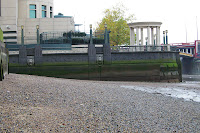
I discussed the problem with my friends and I heard rumors of there being sand right here in London, on the banks of the Thames. I went to investigate.


After walking around the Thames for a good few hours, found about 2mx2m of useable sand near Vauxhall station. The pictures above show Embankment, Westminster and Vauxhall.


The photos above are some of the various experiments I tried out while there. Since it has to be brilliant white, when I next go out to take photos, I'll spray paint the 'n' while it's set in sand. For the destroy picture, I aim to catch the sea at high tide and get pictures of the sea washing the sand away. That's all for now.